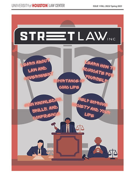
University of Houston Street Law
Street Law Newsletter
Street Law Program Newsletter
Client: University of Houston – Street Law Program (2023)
The University of Houston’s Street Law initiative equips community members with practical legal knowledge. I was invited to design an engaging newsletter that would both update current participants and attract new ones.
Working closely with program coordinators, I gathered photos, logos, faculty quotes, and student testimonials to showcase the program’s real-world impact. I then built a clean, visually driven layout: bold section headers guide the reader, while dynamic graphics and concise copy highlight key successes, upcoming workshops, and enrollment details.
The finished piece does more than inform—it fosters a sense of community and motivates readers to get involved, reinforcing Street Law’s mission of empowerment through education.
Key contributions
-
Transformed raw content into a cohesive, brand-aligned publication
-
Balanced clarity with visual appeal to boost readership and response rates
-
Amplified program impact stories to inspire new participant sign-ups
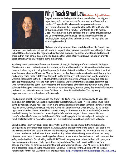
On this page, I needed to undertake a thorough rearrangement of the layout to ensure that all the text and the accompanying image fit cohesively and effectively. I began by assessing the original placement of each element, considering the flow of information and the visual balance of the page.
Initially, I experimented with different configurations, shifting the image to various positions to determine the most impactful placement. My goal was to align the visual elements with the corresponding text, creating a logical progression that would guide the reader's eye and enhance comprehension.
In addition to repositioning the image, I adjusted text formatting, including font sizes, line spacing, and paragraph breaks, to improve readability. I also ensured that there was adequate white space to prevent the page from feeling crowded. Each textual element was carefully considered for its importance and relevance, so I prioritized key information to be more prominent while maintaining an overall aesthetically pleasing design.
Ultimately, this rearrangement required a careful balance of creativity and practicality, resulting in a page that not only accommodates all content but also engages the reader and communicates the intended message effectively.
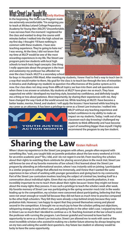
On this page, I undertook a comprehensive rearrangement of the layout to ensure that all the text and multiple images could fit together harmoniously and effectively. The first step involved closely examining the original design, noting where the text and images were placed and identifying any areas where adjustments were necessary.
I began by gathering all the text content and images that needed to be included, categorizing them based on their relevance and the narrative flow. This helped me prioritize which pieces of information and visuals were most essential to the overall message I wanted to convey.
Next, I experimented with several layout configurations, moving the images around to see how they interacted with the text. I considered placing some images side by side with the text for a cohesive look, while larger images were evaluated for positions that would serve as focal points, drawing the reader’s eye.
In addition to repositioning the images, I paid close attention to the text formatting. I adjusted font sizes, line spacing, and paragraph breaks to enhance readability and ensure that the text complemented the visuals rather than competing with them. I also made sure to incorporate white space around each element, which helps in creating a clean and organized look that prevents the page from feeling cluttered.
Throughout this process, I continually assessed the overall balance of the page, making adjustments as needed to maintain visual appeal. The goal was to create a well-structured flow that would guide the reader through the content seamlessly while effectively showcasing each image in conjunction with the related text.
Ultimately, this meticulous rearrangement created a visually engaging page that not only accommodated all the elements but also enhanced the reader's experience by making the content accessible and enjoyable to navigate.
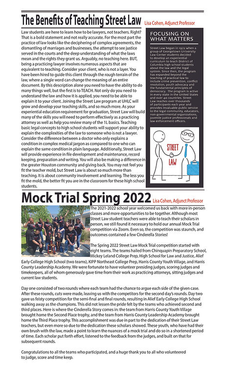
On this page, I needed to rearrange the layout to fit all the text, multiple images, and a text/image box in a cohesive and visually appealing way. I began by assessing the original design and compiling all the necessary elements to understand how they could best fit together.
I experimented with different configurations, placing images alongside relevant text for greater visual interest and ensuring that some larger images served as focal points. The positioning of the text/image box was carefully considered to enhance the overall layout without overcrowding the page.
I also adjusted the text formatting by fine-tuning font sizes, line spacing, and paragraph breaks to improve readability. Ample white space was incorporated around each element to create a clean look.
Throughout this process, I focused on achieving a balanced and harmonious layout that allowed for seamless navigation. The final result was a polished page that effectively conveyed the intended message while engaging the reader.
Street Law Mock Trial Shirt
Mock Trial T-Shirt Design
Client: University of Houston – Street Law Program (Spring 2024)
Each year the Street Law program marks its annual Mock Trial with a commemorative shirt. For the 2024 edition, I was asked to create a design that united the event’s legal symbolism with the program’s core values.
The final graphic centers on the scales of justice and a gavel—classic icons of balance, fairness, and authority—rendered in a bold, contemporary line style. Encircling these symbols, the words “Education,” “Justice,” and “Empowerment” form a clean typographic ring, making the program’s mission instantly visible from a distance while maintaining readability up close.
Color, spacing, and hierarchy were carefully tuned so the design feels equally at home on a courtroom-inspired black tee or a vibrant student-friendly palette. The result is a wearable emblem that captures the spirit of the Mock Trial, celebrates participants’ dedication, and reinforces Street Law’s commitment to equipping the community with legal knowledge.


Street Law Mock Trial Certificate
Street Law Program Certificates
Client: University of Houston – Street Law Program (2023)
As part of the University of Houston’s Street Law initiative, I was asked to design certificates for high school students who completed the program and participated in its culminating mock trial event. The program pairs law students with local high schools to teach essential legal concepts, helping young participants understand their rights and develop skills in critical thinking, public speaking, and legal reasoning.
The certificates were created to formally recognize the students’ dedication and growth. My design focused on creating a professional yet approachable look—balancing institutional credibility with the celebratory nature of the achievement. I incorporated the program’s branding and used thoughtful layout, typography, and visual hierarchy to ensure clarity, elegance, and visual impact.
This project demonstrates my ability to:
-
Create official documents that are both meaningful and visually polished
-
Design for academic and youth-centered programs with sensitivity and purpose
-
Support educational initiatives through design that reinforces recognition and pride